Next: Event Handling, Previous: Widget Creation, Up: Tk [Contents][Index]
So far we have described each of the Tk widgets but have not mentioned how they are arranged to be displayed. Tk separates the creating of widgets from the way they are arranged for display. The “geometry” of the display is handled by a “geometry manager”. A geometry manager is handed the set of widgets to display with instructions on their layout. The layout instructions are particular to each geometry manager.
Tk comes with three distinct geometry managers: grid,
place, and pack. As might be expected the grid
geometry manager is useful for creating tables of widgets, for example,
a table of buttons.
The place geometry manager simply gives each widget an X and Y
coordinate and places them at that coordinate in their particular parent
window.
The pack geometry manager places widgets according to
constraints, like “these three button widgets should be packed together
from the left in their parent widget, and should resize with the
parent”.
(In practice the grid and pack geometry managers are the
most useful because they can easily handle events such as resizing of
the toplevel window, automatically adjusting the display in a sensible
manner. place is not so useful for this.)
Each container widget (the master) has a geometry manager associated with it, which tells the container how to display its sub-widgets (slaves) inside it. A single master has one and only one kind of geometry manager associated with it, but each master can have a different kind. For example, a frame widget can use the packer to pack other frames inside it. One of the slave frames could use the grid manager to display buttons inside it itself, while another slave frame could use the packer to pack labels inside it itself.
The problem is how to display widgets. For example, there is an empty
frame widget inside which a bunch of other widgets will be displayed.
The pack geometry manager’s solution to this problem is to
successively pack widgets into the empty space left in the container
widget. The container widget is the master widget, and the widgets
packed into it are its slaves. The slaves are packed in a sequence: the
packing order.
What the packer does is to take the next slave to be packed. It allocates an area for the slave to be packed into from the remaining space in the master. Which part of the space is allocated depends on instructions to the packer. When the size of the space has been determined, this is sliced off the free space, and allocated to the widget that is displayed in it. Then the remaining space is available to subsequent slaves.
At any one time the space left for packing is a rectangle. If the widget is too small to use up a whole slice from the length or breadth of the free rectangle, then still a whole slice is allocated so that the free space is always rectangular.
It can be tricky to get the packing instructions right to get the desired finished effect, but a large number of arrangements of widgets is possible using the packer.
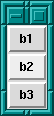
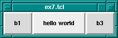
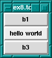
Let us take a simple example: three buttons packed into the root window.
First we create the buttons; see also library('tcltk/examples/ex3.tcl'):
button .b1 -text b1
button .b2 -text b2
button .b3 -text b3
then we can pack them thus:
pack .b1 .b2 .b3
which produces a display of the three buttons, one on top of the other,
button .b1 on the top, and button .b3 on the bottom.
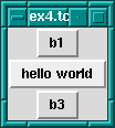
If we change the size of the text in button .b2 through the command:
.b2 config -text "hello world"
then we see that the window grows to fit the middle button, but the other two buttons stay their original size.
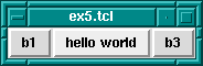
The packer defaults to packing widgets in from the top of the master. Other directions can be specified. For example, the command:
pack .b1 .b2 .b3 -side left
will pack starting at the left hand side of the window.
The result of this is that the buttons are formed in a horizontal row
with the wider button, .b2, in the middle.
It is possible to leave space between widgets through the padding options to the packer: -padx and -pady. What these do is to allocate space to the slave that is padded with the padding distances. An example would be:
pack .b1 .b2 .b3 -side left -padx 10
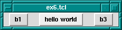
which adds 10 pixels of space to either side of the button widgets.
This has the effect of leaving 10 pixels at the left side of button
.b1, 20 pixels between buttons .b1 and .b2, 20
pixels between buttons .b2 and .b3, and finally 10 pixels
on the right side of button .b3.
That was external padding for spacing widgets. There is also internal padding for increasing the size of widgets in the X and Y directions by a certain amount, through -ipadx and -ipady options; i.e. internal padding. For example:
pack .b1 .b2 .b3 -side left -ipadx 10 -ipady 10
instead of spacing out the widgets, will increase their dimensions by 10 pixels in each direction.
Remember that space is allocated to a widget from the currently available space left in the master widget by cutting off a complete slice from that space. It is often the case that the slice is bigger that the widget to be displayed in it.
There are further options for allowing a widget to fill the whole slice
allocated to it. This is done through the -fill option, which
can have one of four values: none for no filling (default),
x to fill horizontally only, y to fill vertically only,
and both to fill both horizontally and vertically at the same
time.
Filling is useful, for example, for creating buttons that are the same size even though they display texts of differing lengths. To take our button example again, the following code produces three buttons, one on top of each other, but of the same size:
button .b1 -text b1
button .b2 -text "hello world"
button .b3 -text b3
pack .b1 .b2 .b3 -fill x
fill For Evenly Sized Widgets
How does this work? The width of the toplevel windows is dictated by
button .b2 because it has the widest text. Because the three
buttons are packed from top to bottom, the slices of space
allocated to them are cut progressively straight along the top of the
remaining space. i.e. each widget gets a horizontal slice of space the
same width cut from the top-level widget. Only the wide button
.b2 would normally fit the whole width of its slice. But by
allowing the other two widgets to fill horizontally, they will also
take up the whole width of their slices. The result: 3 buttons stacked
on top of each other, each with the same width, although the texts they
display are not the same length.
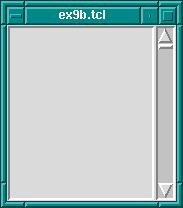
A further common example is adding a scrollbar to a listbox.
The trick is to get the scrollbar to size itself to the listbox;
see also library('tcltk/examples/ex9a.tcl'):
listbox .l
scrollbar .s
pack .l .s -side left
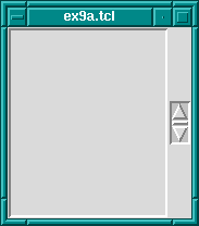
So far we have a listbox on the left and a tiny scrollbar on the right. To get the scrollbar to fill up the vertical space around it add the following command:
pack .s -fill y
Now the display looks like a normal listbox with a scrollbar.
Why does this work? They are packed from the left, so first a large
vertical slice of the master is given to the listbox, then a thin
vertical slice is given to the scrollbar. The scrollbar has a small
default width and height and so it does not fill the vertical space of
its slice. But filling in the vertical direction (through the
pack .s -fill y command) allows it to fill its space, and so
it adjusts to the height of the listbox.
The fill packing option specifies whether the widget should fill
space left over in its slice of space. A further option to take into
account is what happens when the space allocated to the master widget is
much greater than the that used by its slaves. This is not usually a
problem initially because the master container widget is sized to
shrink-wrap around the space used by its slaves. If the container is
subsequently resized, however, to a much larger size, then there is a question
as to what should happen to the slave widgets. A common example of
resizing a container widget is the resizing of a top-level window
widget.
The default behavior of the packer is not to change the size or
arrangement of the slave widgets. There is an option though through the
expand option to cause the slices of space allocated to slaves to
expand to fill the newly available space in the master. expand can
have one of two values: 0 for no expansion, and 1 for expansion.
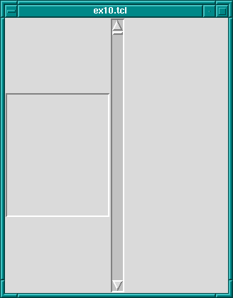
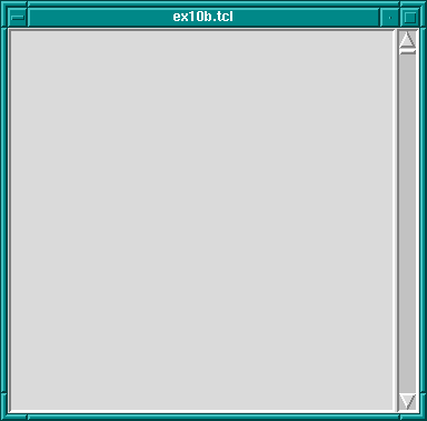
Take the listbox-scrollbar example; see also library('tcltk/examples/ex10.tcl'):
listbox .l
scrollbar .s
pack .l -side left
pack .s -side left -fill y
Initially this looks good, but now resize the window to a much bigger size. You will find that the listbox stays the same size and that empty space appears at the top and bottom of it, and that the scrollbar resizes in the vertical. It is now not so nice.
We can fix part of the problem by having the listbox expand to fill the extra space generated by resizing the window.
pack .l -side left -expand 1
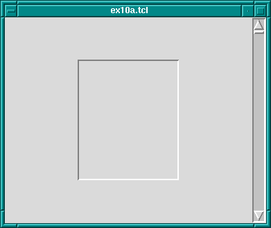
The problem now is that expand just expands the space allocated
to the listbox, it does not stretch the listbox itself. To achieve that
we need to apply the fill option to the listbox too.
pack .l -side left -expand 1 -fill both
fill
Now whichever way the top-level window is resized, the listbox-scrollbar combination should look good.
If more than one widget has the expansion bit set, then the space is
allocated equally to those widgets. This can be used, for example, to
make a row of buttons of equal size that resize to fill the widget of their
container.
Try the following code; see also library('tcltk/examples/ex11.tcl'):
button .b1 -text "one"
button .b2 -text "two"
button .b3 -text "three"
pack .b1 .b2 .b3 -side left -fill x -expand 1
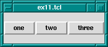
Now resize the window. You will see that the buttons resize to fill the width of the window, each taking an equal third of the width.
Please note: the best way to get the hang of the packer is to play with it. Often the results are not what you expect, especially when it comes to fill and expand options. When you have created a display that looks pleasing, always try resizing the window to see if it still looks pleasing, or whether some of your fill and expand options need revising.
There is an option to change how a slave is displayed if its allocated
space is larger than itself. Normally it will be displayed
centered. That can be changed by anchoring it with the -anchor
option. The option takes a compass direction as its argument:
n, s, e, w, nw, ne, sw,
se, or c (for center).
For example, the previous example with the resizing buttons displays
the buttons in the center of the window, the default anchoring point.
If we wanted the buttons to be displayed at the top of the window, then
we would anchor them there thus; see also library('tcltk/examples/ex12.tcl'):
button .b1 -text "one"
button .b2 -text "two"
button .b3 -text "three"
pack .b1 .b2 .b3 -side left -fill x -expand 1 -anchor n
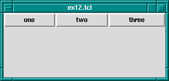
Each button is anchored at the top of its slice and so in this case is displayed at the top of the window.
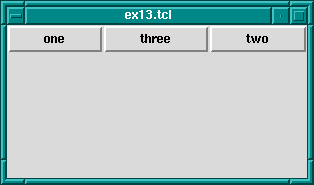
The packing order of widget can also be changed. For example,
pack .b3 -before .b2
will change the positions of .b2 and .b3 in our examples.
The grid geometry manager is useful for arranging widgets in grids or tables. A grid has a number of rows and columns and a widget can occupy one of more adjacent rows and columns.
A simple example of arranging three buttons; see also library('tcltk/examples/ex14.tcl'):
button .b1 -text b1
button .b2 -text b2
button .b3 -text b3
grid .b1 -row 0 -column 0
grid .b2 -row 1 -column 0
grid .b3 -row 0 -column 1 -rowspan 2
this will display button .b1 above button .b2. Button
.b3 will be displayed in the next column and it will take up two
rows.

grid Geometry Manager
However, .b3 will be displayed in the center of the space
allocated to it. It is possible to get it to expand to fill the two rows
it has using the -sticky option. The -sticky option says
to which edges of its cells a widget “sticks” to, i.e. expands to reach.
(This is like the fill and expand options in the pack manager.) So to
get .b3 to expand to fill its space we could use the following:
grid .b3 -sticky ns
which says stick in the north and south directions (top and bottom).
This results in .b3 taking up two rows and filling them.

grid Geometry Manager, Cells With Sticky Edges
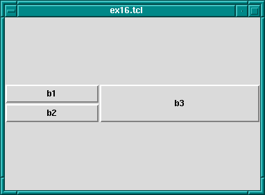
There are plenty of other options to the grid geometry manager. For example, it is possible to give some rows/columns more “weight” than others, which gives them more space in the master. For example, if in the above example you wanted to allocate 1/3 of the width of the master to column 0 and 2/3 of the width to column 1, then the following commands would achieve that:
grid columnconfigure . 0 -weight 1
grid columnconfigure . 1 -weight 2
which says that the weight of column 0 for master . (the root window)
is 1 and the weight of column 1 is 2. Since column 1 has more weight than
column 0 it gets proportionately more space in the master.
It may not be apparent that this works until you resize the window.
You can see even more easily how much space is allocated to each button
by making expanding them to fill their space through the sticky option.
The whole example looks like this; see also library('tcltk/examples/ex16.tcl'):
button .b1 -text b1
button .b2 -text b2
button .b3 -text b3
grid .b1 -row 0 -column 0 -sticky nsew
grid .b2 -row 1 -column 0 -sticky nsew
grid .b3 -row 0 -column 1 -rowspan 2 -sticky nsew
grid columnconfigure . 0 -weight 1
grid columnconfigure . 1 -weight 2
Now resize the window to various sizes and we will see that button
.b3 has twice the width of buttons .b1 and .b2.
The same kind of thing can be specified for each row too via the
grid rowconfigure command.
For other options and a full explanation of the grid manager see the manual.
place simply places the slave widgets in the master at the given
x and y coordinates. It displays the widgets with the given width and
height. For example (see also library('tcltk/examples/ex17.tcl')):
button .b1 -text b1
button .b2 -text b2
button .b3 -text b3
place .b1 -x 0 -y 0
place .b2 -x 100 -y 100
place .b3 -x 200 -y 200
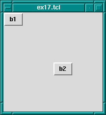
place Geometry Manager
will place the buttons .b1, .b2, and .b3 along a
diagonal 100 pixels apart in both the x and y directions. Heights and
widths can be given in absolute sizes, or relative to the size of the
master in which case they are specified as a floating point proportion
of the master; 0.0 being no size and 1.0 being the size of the master.
x and y coordinates can also be specified in a relative way, also as a
floating point number. For example, a relative y coordinate of 0.0
refers to the top edge of the master, while 1.0 refers to the bottom
edge. If both relative and absolute x and y values are specified, then
they are summed.
Through this system the placer allows widgets to be placed on a kind of rubber sheet. If all the coordinates are specified in relative terms, as the master is resized, then so will the slaves move to their new relative positions.